Gallery

Saturday, August 20, 2011

Mencari 'unik' - A Look into Visual Confusion Photography

Artikel ni boleh berguna untuk semua..
mencari kelainan dalam setiap klik..
visual confusion..


Photobucket

Photography can serve many purposes. It can make you laugh, make you cry, and help you appreciate the beauty of the natural world. Or, as with visual confusion photography, it can provoke senses of confusion and wonder.

The following are defining elements of visual confusion photography and should be followed if you want to become involved with this trend. As a starting point, view a collection of visual confusion photography examples here before learning more about this trend.


LOOK FOR THE UNUSUAL

Photobucket

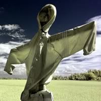
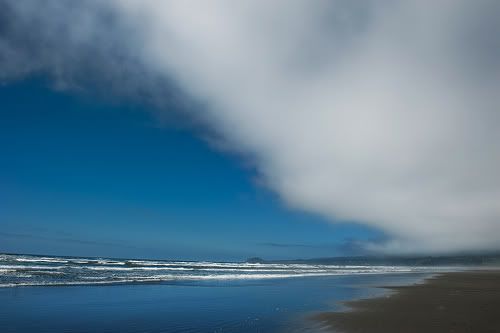
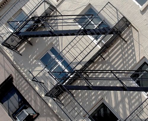
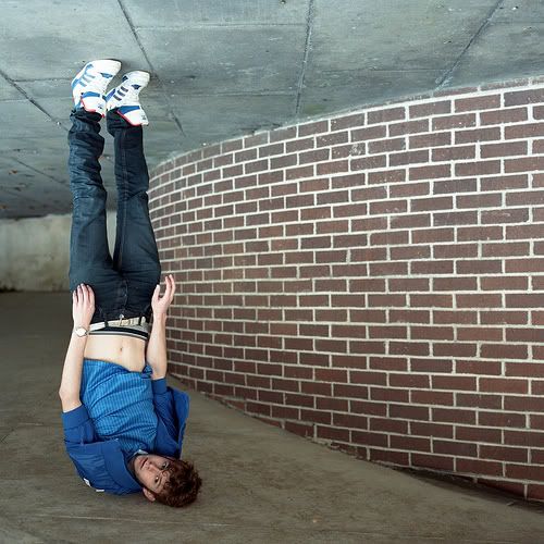
The main element of visual confusion photography is causing the viewers of a photo to think twice about its composition. As evidenced in the trend’s name, visual confusion photos are meant to be thought provoking and push the limits of reality.

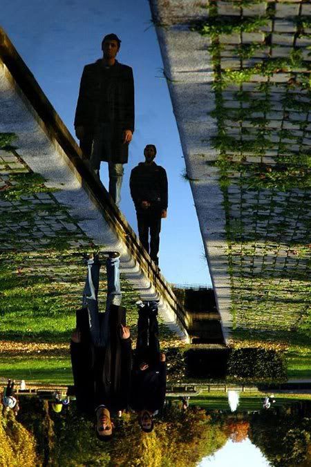
When shooting visual confusion photos, search for odd reflections and unique angles. These elements will cause the photo’s viewers to ponder over where the sky is, where the earth is, and how the shot was even achieved.

Don’t be afraid to try new things with your camera in hand. The main point of being a visual confusion photographer is to step outside the norm and push the boundaries of the natural world.


KEEP AN OPEN MIND

Photobucket

As you begin experimenting with visual confusion photography, you may start doubting the photos you are taking. However, resist this self-doubt and keep an open mind.

In doing so, you will discover the possibilities with this trend and will be less afraid to take risks in other areas of your life. Being a visionary is never easy. However, in taking risks, you learn what your true limits are and discover just how creative your mind can be.


GO NATURAL

Photobucket

With so many graphic design software programs currently available, many photographers and designers are creating artificial examples of visual confusion photography. While these examples can be interesting, they go against the core of this trend.

When testing out visual confusion photography, resist the urge to alter the composition of your photos with software. Instead, capture thought provoking photos in their natural elements. In doing so, you will advocate the power of photographing the natural world.


LEARN FROM PROS

Photobucket

The best way to start out in visual confusion photography is to view photography examples from the leaders. Many online platforms such as Flickr and Twitter are great outlets to connect with other visual confusion advocates and join visual confusion groups.

One top Flickr photography member whose work is worth checking out is Keirfernie. This Flickr member has numerous stellar visual confusion photographs that can help orientate you to what is possible in photography. Another top Flickr visual confusion photography member is Tomasito, whose wonderfully composed photographs are perfect examples of why visual confusion photography is on the rise.

With the rise in digital photography and photo editing software, anyone can capture a great photo. However, not everyone has the creativity to view the world from a new perspective and bend reality. As such, to define yourself as a true photographer, begin experimenting with visual confusion photography and discover just how strange the natural world can be.


sumber:

http://daddu.net/a-look-into-visual-confusion-photography/


Friday, August 19, 2011

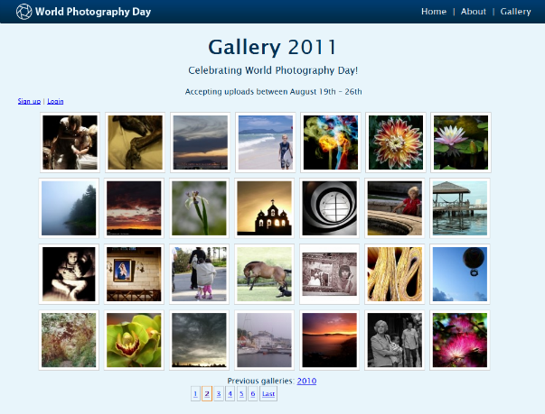
HAPPY WORLD PHOTOGRAPHY DAY!

Happy World Photography Day...
Photobucket

celebrate photography

with photography lovers across the globe on August 19th 2011

http://www.worldphotoday.org/

Thursday, August 18, 2011

Over-Editing in Photoshop: How to Avoid 25 Common Editing Mistakes.

By: MCP Thoughts Article.


Over-editing in Photoshop is a chronic problem. When photographers first get and learn to use Photoshop, they often are in awe of its capabilities but do not have the skills to use it properly. As a result, many start out playing with filters and plug-ins and over-use them. Sometimes photographers feel Photoshop is all powerful and take images that should have been in a reject pile,and they try to 'save' them.


As a rule, Photoshop should not be used to save unacceptable photos. If a photo is out of focus, blown out, severely under-exposed, or has really awkward composition, Photoshop will not make it drastically better. Used in excess, it can actually make the image worse.


Photoshop is best used as a tool to make good photos great. But remember, when editing, less is often more. Over-editing photos can make them go from good to bad. When I did my post on photography fads, a few weeks ago, I mentioned doing future article on editing fads. After thinking about it, I realized that many “fads” were actually immature or poor editing.


Some things like selective color definitely can fall into fads or cliches, meaning they were over-used for a period of time. While selective color edits occasionally look great, more often than not, it is overdone. The best example I can think of is when a photo is turned black and white and the eyes are colored back to blue.


Photobucket


Here are 25 of the most common mistakes photographers make when editing retouching images:


  1. General over editing – often, but not always, the best edits are subtle and enhance what is good about the photo.

  2. Over popping the colors – while I love vibrant color, many who are new photo editing, give their images an almost neon color. When you edit watch for details in your color areas. If these start to disappear, you have gone too far.

  3. Using the latest editing fads on every photo - I understand the need to experiment as an artist. But think about the longevity of your editing. What edits might go out of style? Clean post processing will never go out of style. Rich black and white conversions are not likely to either. Currently I see a lot of photos converted with a “fake” hazy look. Yellow skies seem to be another “fad” which may look good occasionally, but probably not if used on every photo. Years from now, we may wonder how much pollution was in our air. And while I love the look of dreamy sun flare when captured in camera, if you add it in post processing, really judge if it adds to your image. And please do not add it to every image. These fads may add to certain photos, but definitely will not make every photo look better.

  4. Blowing things out – many like bright photos, me included. But when editing, make sure to have your histogram and your info palette open. Constantly check for numbers creeping into the 250s (255 is totally blown) in any of the channels (R, G or B). If you have a photo that already has blow outs, and you shot RAW, go back to Adobe Camera Raw, Lightroom, or Aperture and decrease exposure or recover it. If you have spots of blown areas or speckles lighting, be more aware when shooting, and move locations.

  5. Adding too much contrast and losing details in shadows – Similar to blowing out information is clipping your shadows, so that the dark areas are pure black. When your see numbers in your info palette close to or at zero, you have no information left in the shadows. Back off your conversion by lowering opacity or even masking.

  6. Messing with curves before you know how it works – “Curves” is possibly the most powerful tool in Photoshop. But it is intimidating to new users. Most either avoid it or misuse it. If used improperly, you can do more harm than good to your highlights, shadows, and color. When skin turns orange, many times the culprit is an s-curve. Turn your blend mode to luminosity when this happens so the curve does not impact color and skin tones. If you want to learn more about curves, check out the MCP Curves in Photoshop Training Class.

  7. Muddy black and white conversions – Converting to gray-scale alone is rarely an effective method for a rich black and white. Even when using better methods, like the black and white adjustment layer, gradient map, duotones, or channel mixers, you may need to use curves to help. Also be aware of your color. If you convert to black and white because your color was horrible, likely your black and white will not be as rich either. I always fix color prior to converting to black and white.

  8. Heavy toning of monochrome images - Occasionally this can be pulled off well, but often times a light tint to a monochromatic conversion is nice is a better choice. Sepia and really heavy toning often looks out of place. Chose tones and opacity of them carefully.

  9. Blindly using Photoshop actions without understanding what they are doing – Get to know the program before diving in. And get to know your actions too. Understand what each does so you can get the best results and have the most control.

  10. Cropping like crazy – Definitely some photos benefit from cropping. But remember when you crop in Photoshop, it throws out pixels and information. So if you are unsure what size you may need, keep your edited photo pre-crop too. Beware of cropping in too close in case you need a different size ratio later. With cropping, also make sure you are not chopping your subject at the joints (like wrists, elbows, neck, knees, ankles, hips, etc).

  11. Alien eyes - I love eyes to sparkle. The best way to accomplish this is by getting light in the eyes and nailing your focus in camera. The Eye Doctor action can help you if you have good focus and light, but again, do NOT over-use it. You want eyes to sparkle without looking fake. Just give eyes a little life, and then stop. They do not need a “full life” of their own.

  12. Over whitening teeth – Same concept as the eyes… Teeth usually do not glow in real life, so they should not in your photos either. If you wish to take out a little yellow or brighten them a touch, go ahead. But make sure when you look at the image, the teeth do not jump out first.

  13. Plastic skin – Skin smoothing is really popular these days. After all, who wants deep wrinkles, acne, large pores, and uneven skin? Nobody. But who wants to look like a plastic Barbie? Nobody… So when using Portraiture, MCP’s Magic Skin smoothing actions, or the built in healing and patch tools, remember moderation is the key. Work on duplicate layers and lower the opacity and/or use masking to keep the look natural.

  14. Getting rid of under eye shadows – Similarly to plastic skin, when your subject has deep set eyes, you may want to minimize the crease or shadows under the eyes. You do not want to get rid of it completely though. Watch this video tutorial on getting rid of under eye creases in Photoshop for more tips, but remember opacity is your friend.

  15. Halo around subject - When popping color, doing heavy defogs, or when selective lightening or darkening, be careful of halos around your subject. When masking these changes, work your way in close to the subject, and adjust brush hardness as necessary.

  16. Soft glow – This look is where things have a dreamy blurred look. Personally I am for sharpness, so doing this when editing seems counter-intuitive to me. I am not a fan of this look. But if you do choose to do it, please do so in moderation and on pictures where it adds to the mood of the image.

  17. Heavy vignettes - Again, I use vignetting lightly and purposefully. Those new to editing often overuse these and pop dark edges on every image. My recommendation, try it as a non-destructive layer, play with opacity, and really decide if it helps or hurts your photograph.

  18. Over sharpening – Digital images need sharpening. Sharpening takes an in focus photo and makes it crisp. But when you have a photo that is blurry, out of focus or fairly soft, it actually does more harm than good. Also be aware of adding too much sharpening. Unfortunately with sharpening, especially for print, it is not one size fits all. There are no magic numbers to use every time. You will need to experiment. Zoom in to 100% and see what it looks like.

  19. Getting rid of too much noise – I love using Noiseware when I shoot at higher ISOs. It really can help take that graininess out of the photograph. But be careful when using as it can make parts of your image blotchy, take away texture, make clothing or hair look over smooth. Zoom in and peek. Run the noise reduction filter on a duplicate layer so you can adjust the opacity, and add a mask if needed to bring back detail in certain parts.

  20. Heavily blurring the background in Photoshop – Bokeh is beautiful. I love the look of a blurred background where the subject just pops off of it. But please, do this in camera by shooting with a wide aperture and by having space between your subject and the background. It is very rare that a photographer can pull off natural looking background blur using the Gaussian Blur filter. Usually it looks fake since there is no fall off and often abruptly stops.

  21. Poor extractions – When I do Private photoshop training of new photographers, I almost always get asked how to extract a subject from the background. Unless you prepare ahead with the photography, using a green screen and even background lighting, it is a challenge for even professional editors and retouchers. If you do attempt an extraction, be aware of jagged edges and obvious cut outs.Take your time, and make sure you do not leave rough edge, etc. As a rule, I would recommend paying attention to your background when shooting, and use wide apertures when your surroundings are less than ideal.

  22. Overdoing textures – Textures may fall under fads or at least trends. We will need to see how far they are used as overlays on images in the future. For now, remember if using a texture, less can be more. Make sure it actually enhances the image. Do not just use texture to use texture. This video can teach you how to take texture off the skin of subjects or remove the color tone from it or blur the texture away.

  23. Fake HDR – High Dynamic Range images have increased in popularity. When multiple exposures are taken and then blended, these images can be impressive. There are ways to fake this look in post processing in Lightroom and Photoshop. Occasionally it can create in an interesting look. But often times, they do not come out looking great. If you try doing HDR with one photo, using one exposure, haloing can occur. You may need to decrease the effect for better quality.

  24. Playing with plug-ins and artistic filters – When you get Photoshop, it can be tempting to make your photo into a watercolor, then a mosaic, then an Andy Warhol looking print. You get the idea. Filters can equal fun. But usually most of these do not make for a professional looking portrait. So if you are scrapbooking or just entertaining yourself, play around. But for the most part, these tools are better left where they are.

  25. Overdoing selective color - Some might say to avoid selective color altogether. It is probably the first thing people think of when you say “editing fad.” I am not a huge fan, but every once in a while, I see images that are enhanced by this. Most of the time, however, it does not make an image look better. So consider why you are doing it. Did the customer ask or are you just playing. And please, for me, do not convert to black and white and then colorize the eyes. That just freaks me out. If you have done it in the past, do not take offense. But it just is not the best way to show off beautiful blue eyes…

Tips Fotografi-How To Read Photographs

Photobucket
A severely malnourished refugee-child displaying innocence and helplessness at the Khao-I-Dang camp in Thailand. UN Photo/Saw Lwin.


1. Is there a clear center of interest?
In a strong photo, the viewer can immediately identify the subject. While this sounds like a no-brainer, a surprisingly high number of photos fail to clearly identify the main subject. Instead, a complex montage of elements compete for the viewer's attention.
In a strong photo, the subject should dominate the image and form the viewer's first impression. If the subject is strong, the viewer's eyes may move to explore other areas of the image, but the eyes are drawn inevitably back to the subject.
To evaluate your own photos for a strong center of interest, try asking yourself these questions.
When you look at the photo, what is the first thing you see? If you're evaluating your own image, is what you see first the subject you had in mind for the photograph?

-What holds your eye the longest?

-Do other elements in the image compete with the subject for attention?

-Do technical aspects such as light and the direction of light, depth of field, focus, and so on add to or detract from the subject?

2. Is the image composed well?
In a strong photo, there should be a sense of overall organization. While entire books are written on composition, at the most basic level, composition is the process of establishing a sense of order for the elements within an image.
Note Composition rules or guidelines are a helpful starting point, but they are useful only as long as they enhance the overall image.

As a quick review, here are a few basic composition pointers.

-Fill the frame Filling the frame helps establish the center of interest, and, simultaneously, it helps exclude competing background details. You can fill the frame by moving closer to the subject or by using a longer focal length (or zooming in).

-Organize elements In composition, the Rule of Thirds is often used to organize elements in a composition. This rule is derived from the Golden Section or Golden Rectangle that divides a space, such as a photographic frame, into equal segments to create pleasing proportions. In simple terms, if you apply the Rule of Thirds in photography you simply imagine a tick-tac-toe pattern on the viewfinder. Then, when you place the subject of the photo at one of the intersection points, the result is a pleasing sense of order.

-Control the background A non-distracting backgound is a compositional tool to help bring attention to the subject of the photo. You can control the background by moving your position or moving the subject to avoid background distractions and by using a wider aperture (smaller f-stop) to blur the background. It's a good practice to review the entire scene and, when possible, eliminate or rearrange as many distracting background elements.

-Keep it simple The fewer the elements in a photo, the stronger the statement the image makes. Simplicity also helps prevent the viewer's eye from being distracted.

To evaluate the composition of your images, try asking these questions.

-Is there a sense of order and balance in the image that helps lead the eye through the composition?

-Are elements included that do not contribute to the subject of the image?

-Are elements excluded that, if included, would have enhanced the subject of the image?

-Do the depth of field, focal length (lens or zoom setting), lighting, angle, and perspective enhance the composition?

-Does the crop enhance the composition?

3. Is the focus crisp and is the exposure appropriate?
With the exception of photos that either intentionally show motion or are taken as soft-focus images (such as a portrait), tack-sharp focus is one of the first things that everyone notices first about an image. Going a step further, the center of focus should be on the center of interest of the subject. The sharpest point of the picture should pinpoint what the photographer sees as the most important aspect of the image.
The exposure (the combination of focal length [lens or zoom setting], aperture, shutter speed, and ISO) should also enhance the intent of the photo.

Questions that can help you evaluate whether focus and exposure settings are appropriate for an image include:

-Is the sharpest point in the image on the center of interest of the subject of the photo?

-Does the depth of field enhance the subject, mood, or look of the image or does it distract from it?

-Does the focal length or zoom setting enhance the subject and message?

-Does the image have good overall contrast for the type image the photographer intended?

Wednesday, August 17, 2011

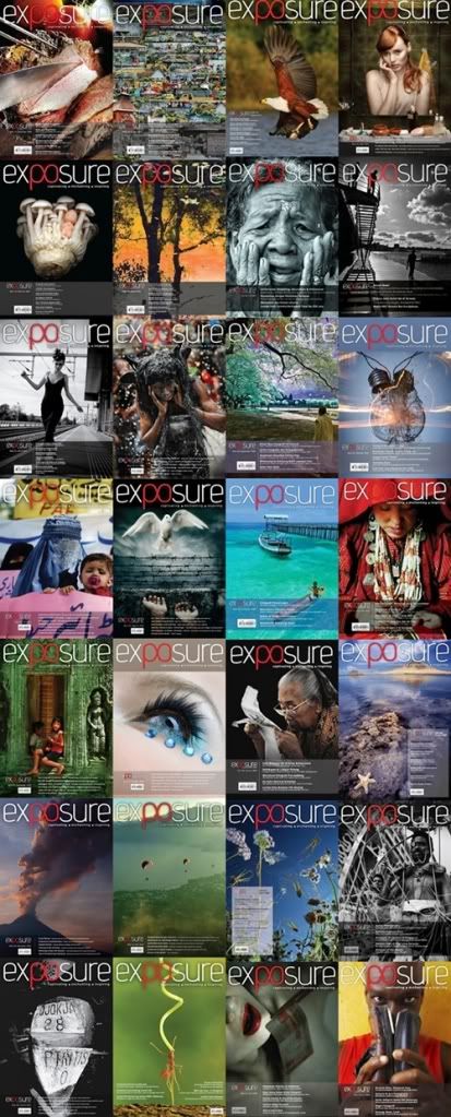
FREE Download Photography Magazine

Agak-agak kalo bosan ke,
or nak cari inspirations or ideas ke..
or maybe nak explore benda2 baru,ilmu baru..
boleh la try download ebooks/pdf photography magazine ni..
interesting gak laa..
utk maklumat lanjut pasal magazine ni visit link ni-

Untuk download links klik sini
or klik kat gambaq kat bawah ni..
Benda free kot..ape ade hal..download je ;D
ada berpuluh edition dah tu..
download dan baca sampai muntah k ;P


Photobucket


Tips Fotografi-Masukkan Cerita dalam Gambar

1st skali,
terima kasih kepada Tuan Reza Mell sbb dah bnyak curah ilmu kat saya..
so..ilmu ni saya kongsi plak kat followers semua..
moga bermanfaat..
boleh lah kalo nak guna bagi yang ingin memperkukuh gambar yang diambil
and boleh berguna utk yg ingin jauh lebih serious dlm bidang photography ni..
di samping mendapatkan gambar yg sedap mata memandang,gambar akan lebih bermakna bila di selitkan dgn penceritaan yg berkesan..tak gitu :)

kalau ada yang nak nota ni,
boleh pass email kat ruangan komen ok :)

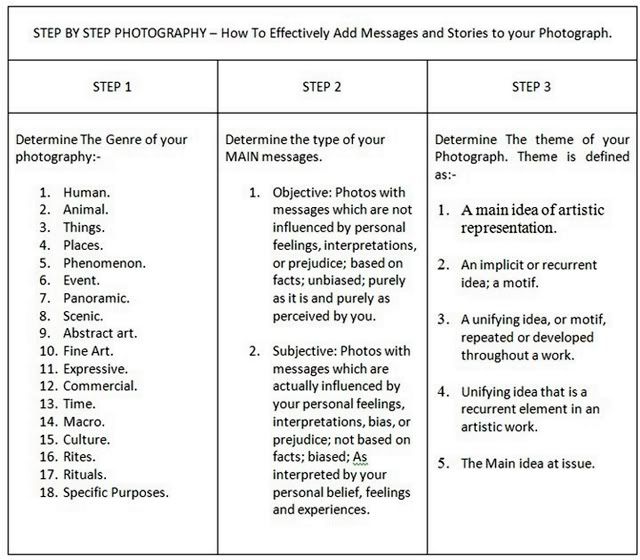
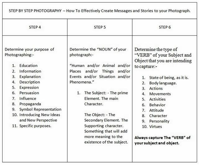
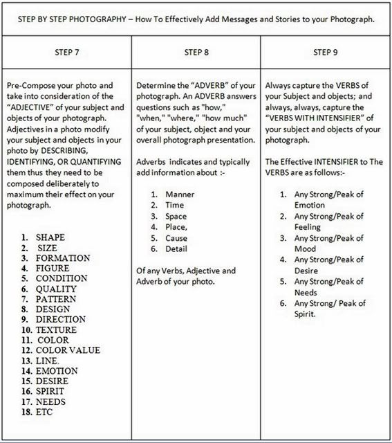
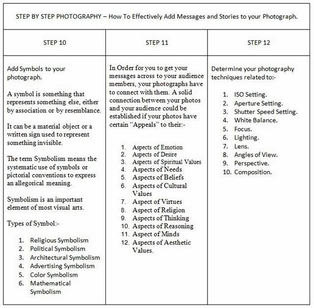
Step by step photography-
How to effectively add messages and stories to your photographs

Photobucket

Photobucket

Photobucket

Photobucket


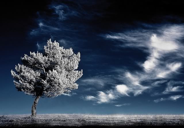
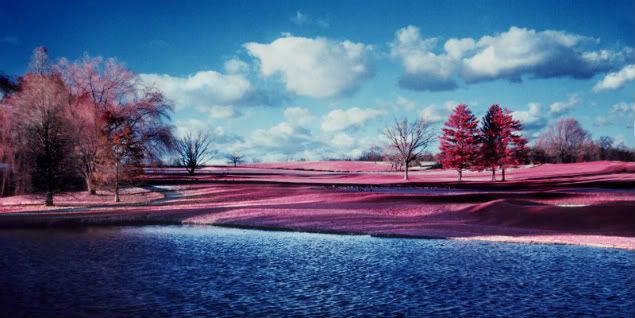
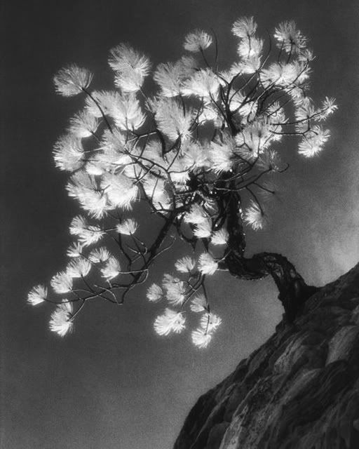
Infrared Photography. Jeles!

JELESNYA!
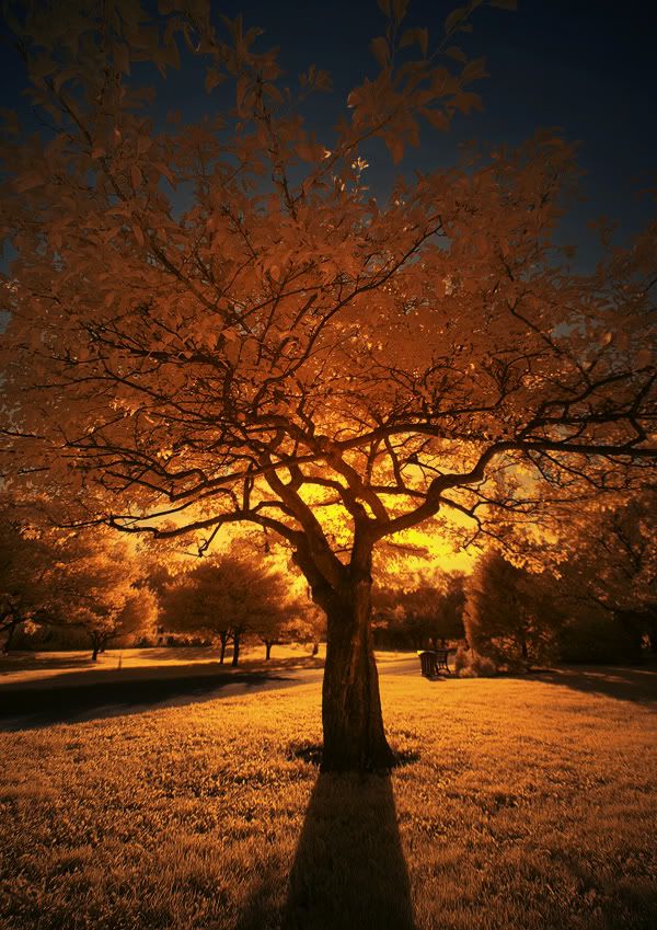
dah lama jugak aku mengidam nak try infrared ni..
sejak aku start main lomo pun aku dah teringin nak cuba infrared ni..
bila dah ada kamera digital makin kuat plak racun dia..
ada plak lobang2 utk film dan kamera..
ahaha..nanti nak kena cuba gak mcm mana pun!

Photobucket

DIGITAL INFRARED
guna digital ni sama ada nak guna filter infrared or 'oprek' camera dslr tu utk jadi kamera IR je..tp mmg mahal la..aku ingat naik sem ni nak angkat compact IR sebijik..

utk maklumat lanjut visit DIGITALIRIS
Dorang ni ada buat oprek kamera ir and ada gak jual compact utk IR ni..ada bnyak version..klik lah link tu utk lebih racun infrared..keh3


Photobucket

FILM INFRARED

ini rare..IR guna film ni ada yg film color which dah hampir pupus..aritu ada jumpa lobang utk color infrared film ni tp mahal+nak kena develop E6 which is kat kl je boleh develop..daimm..
yang black and white infrared film masih wujud lagi tp tulah..aku dah malas nak pegi develop film sejak dua menjak ni..haha

Photobucket

Photobucket

Photobucket


Tuesday, August 16, 2011

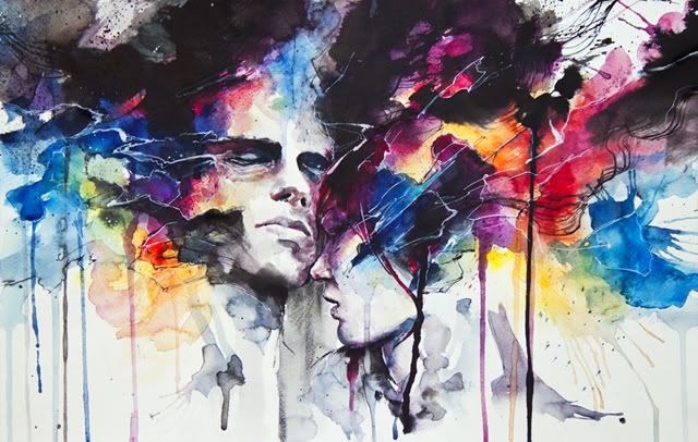
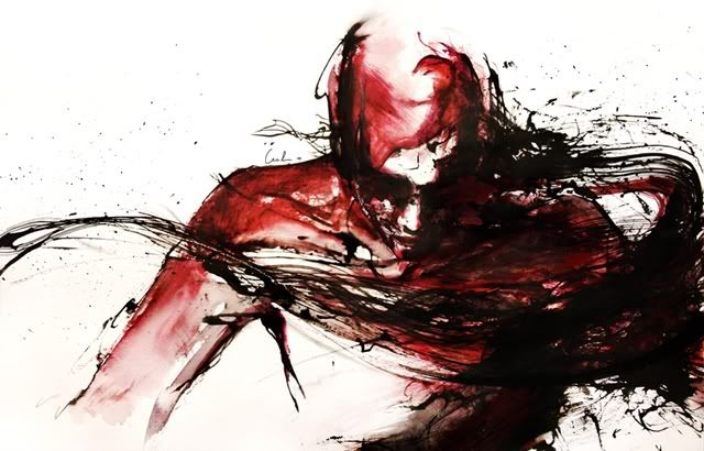
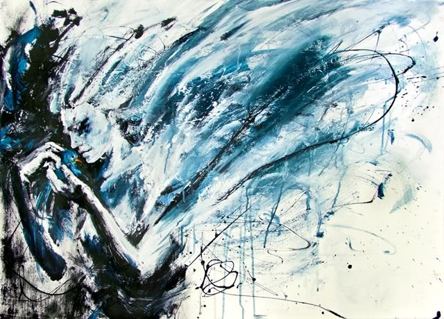
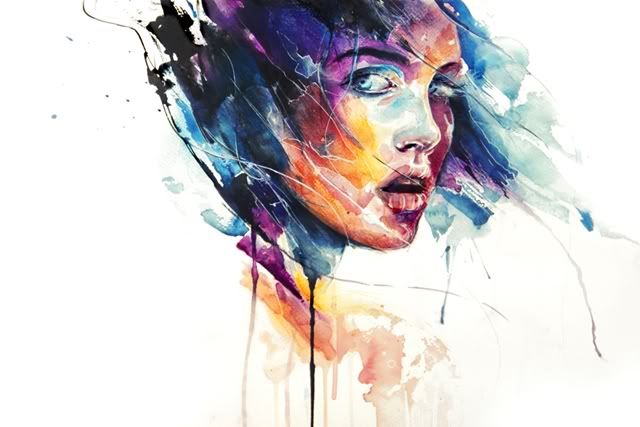
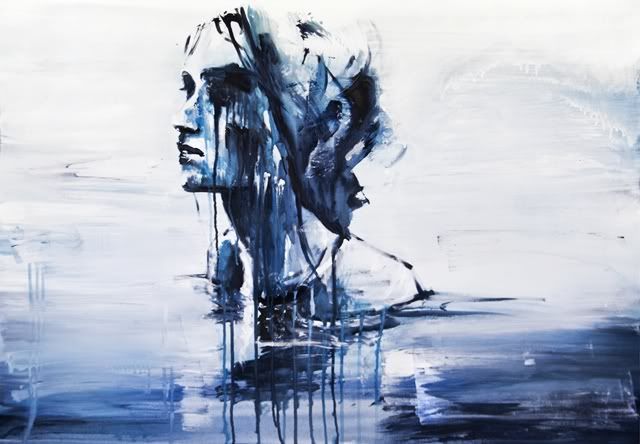
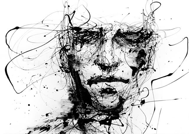
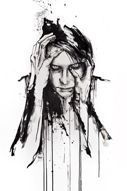
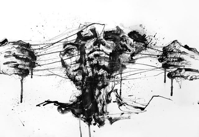
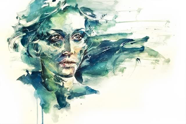
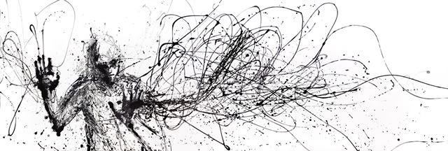
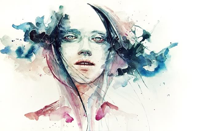
beaiful artwork! jeles!

lawa siak mix media dia ni..
aku suka sbb ada mood and color yg dia apply best!
dia punya watercolor best,then dia punya percik2 ink tu style..
jeles gila tengok orang yg terer2 n berseni ni kan..humph..

ni dia punya deviantart
ni plak dia punya youtube

Photobucket

Photobucket

Photobucket

Photobucket

Photobucket

Photobucket

Photobucket

Photobucket

Photobucket

Photobucket

Photobucket


Monday, August 15, 2011

Rise of Planet of the Ape!

sumpah best..
dari tadi aku dok ulang2 tngok ni..
terbaik!haha..
korang pon kena tngok..best! ;D
dia punya teruja tu lain mcm..keh3..
and ada sedih2 sket..
ok la..haha

Photobucket